Qt Quick Tutorial: 3 Things To Do List Part 4 - Interactivity
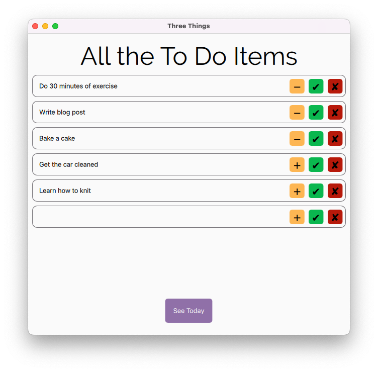
At the end of Part 3 we had a to do list app that could show us a pre-populated list that we couldn’t interact with. That’s somewhat less useful than a piece of paper, so lets make it interactive.
First up lets replace the Text element in ToDoItem.qml with a TextInput.
TextInput {
    id: editItemText
    text: itemName
    Layout.margins: 8
    Layout.fillWidth: true
}
To this we will want to add the ability to strike the text out if the task is marked as complete
font.strikeout: completed
and a method to pass the updated title to our model when return is pressed or focus is lost (something else is clicked on). We’re going to set focus to false in onEditingFinished so that the cursor doesn’t stubbornly stay in the TextInput when enter is pressed.
onEditingFinished: {
    itemName = text
    focus = false
}
Next up we need to make our buttons interactive using the buttonClicked signal we added to CustomButton.
Mark as complete / delete task
These are the simplest of the buttons to link up as we’ve done all the hard work already so now we just need to set the appropriate role:
UpdateButton {
    id: itemCompleted
    color: "#0ab74f"
    symbol: "\\u2714"
    onButtonClicked: completed = !completed;
}

UpdateButton {
    id: removeItem
    color: "#b7190a"
    symbol: "\\u2718"
    onButtonClicked: remove = true
}
Set today
Although we added filtering in Part 3 we left our setToday button invisible at all times:
UpdateButton {
    id: setToday
    visible: false
}
Let’s fix that by:
- linking visibility to the root elements state
- setting the button text to match the value of today
- toggling the value of
todaywhen the button is clicked
UpdateButton {
    id: setToday
    color: "#aaff9400"
    txt.text: today ? "\\u2212" : "\\u002B"
    visible: todoContainer.state === "" ? false : true
    onButtonClicked: today = !today;
}
Add items
We don’t currently have a way to add items to our to do list, we could add another button for this but our user interface (UI) will start getting a bit crowded if we do so lets add a system menu using Qt Labs (WARNING functionality is liable to change).
main.qml
import Qt.labs.platform

Window {
    ...

    MenuBar {
        Menu {
            id: fileMenu
            title: qsTr("&file")
            MenuItem {
                text: qsTr("&New...")
                shortcut: "+"
                onTriggered: console.log("add pressed")\t
            }
        }
    }
}
At this point you will (if your Qt Creator functions the same way as mine) have a lot of 3 warnings about unknown components. You can safely ignore them. If you press run now you should get a native menu bar with one menu (File) and a single menu item (New…) which, if you click on it (or enter +) will log add pressed.
If you don’t get a native menu (you’ll definitely get a menu of some description) you will need to add
app.setAttribute(Qt::AA_DontUseNativeMenuBar, false);
to main.cpp.
In order to be able to add an empty row to our model from QML we need to add a public invokable command to our datamodel.
datamodel.h
Q_INVOKABLE void add();
datamodel.cpp
void DataModel::add() {
    beginInsertRows(QModelIndex(), rowCount(), rowCount());
    _dataObjects << new DataObject("", false, false);
    endInsertRows();
}
Now we can change the Menu Item’s onTriggered property to access that via the filtermodel:
onTriggered: dataModel.sourceModel.add();
Keyboard Interaction
If you build the app now you should be able to edit, add, remove, mark as completed and mark as to do today. Ideally though you would be able to navigate the app using the keyboard alone. Lets start by being able to enter and exit the to do items using the tab key. For this we will need to leverage the keyNavigationWraps property of ListView so that when we get to the end of the list it circles back to the top.
main.qml
ListView {
    id: toDoView
    Layout.fillHeight: true
    Layout.fillWidth: true
    model: dataModel

    keyNavigationWraps: true

    delegate: TodoItem {
        width: toDoView.width
    }

    spacing: 8
    clip: true
}
TodoItem.qml
Now if you add
activeFocusOnTab: true
Keys.onEscapePressed: focus = false
to editItemText you can tab around the to do items and exit them entirely by hitting escape.
Now lets add the ability to access and activate the buttons via the arrow keys using KeyNavigation.right
RowLayout {
    id: todoItem
    ...

    TextInput {
        id: editItemText
        ...
        KeyNavigation.right: setToday
    }

    UpdateButton {
    \tid: setToday
        ...
        KeyNavigation.right: itemCompleted
    }

    UpdateButton {
        id: itemCompleted
        ...
        KeyNavigation.right: removeItem
    }

    UpdateButton {
        id: removeItem
    }
}
Notice that we’re not explicitly setting KeyNavigation.left as KeyNavigation implicitly set’s the other direction unless it is overridden. Equally we’re not worrying about whether the item is visible or not as if it isn’t KeyNavigation attempts to skip the item and focus on the next.
At this point you may notice that the tab order goes funny if you hop into any of the buttons. We’re going to fix that by wrapping our whole TodoItem in a FocusScope:
FocusScope {
    property alias itemWidth: toDoItemContainer.width
    height: toDoItemContainer.height
    x: toDoItemContainer.x
    y: toDoItemContainer.y
    onActiveFocusChanged: {
        if (activeFocus) {
            toDoView.currentIndex = index
        } else {
            editItemText.focus = true
        }
    }
    activeFocusOnTab: true
    Keys.onEscapePressed: {
        toDoView.currentIndex = -1
        focus = false
    }

    Rectangle {
        id: toDoItemContainer
        ...
        RowLayout {
            id: todoItem
            ...
            TextInput {
                id: editItemText
                ...
                focus: true
            }
        }
    }
}
Walkthrough:
FocusScope is not a visual type so it needs to have its height and width explicitly set, because we want to send the width of toDoView to our TodoItem we need to alias toDoItemContainer.width to an accessable property and change the delegate’s property to itemWidth: <em>toDoView</em>.width in main.qml.
Within each FocusScope only one item may have Item::focus set to true (if you set more than one, the last to be set will claim the focus), however both that item and the FocusScope itself have activeFocus so we can leverage the activeFocus property of the FocusScope to ensure the toDoView.currentIndex is set appropriately.
We’re using onActiveFocusChanged to update toDoView.currentIndex and to reset the focus to editItemChanged when the focus moves to a different to do item so that when you tab or use the arrow keys to re-enter the item you’re back in the text.
activeFocusOnTab has been moved to the FocusScope and focus: true is set on the TextInput to keep the behaviour we had to start with.
Keys.onEscapePressed has been moved to the parent element which allows it to work regardless of which element has focus.
CustomButton.qml
In order to be able to interact with our CustomButton using space and return in the same way we can when clicking on it we need to bind those properties to the buttonClicked() signal
Keys.onSpacePressed: buttonClicked()
Keys.onReturnPressed: buttonClicked()
As there is no default visual indicator that the buttons have focus at the moment we might want to add a conditional border colour to make it clear where the focus is:
border.width: 2
border.color: activeFocus ? Qt.darker(color, 1.5) : "transparent"
If we use the darker method from Qt QML we can set the border to be a darker version of the button colour which isn’t quite a shocking as setting it to a static colour is.
Setting the border width is optional, however a 2px border looks better (imo) than the default.
Switch views using a shortcut
In order to switch between our all and today views we’re going to add a shortcut to main.qml.
Window {
    ...
    Shortcut {
        sequence: "Alt+A"
        onActivated: {
            if (root.state === "") {
                root.state = "viewAll"
                dataModel.setShowTodayOnly(false)
            } else {
                root.state = ""
                dataModel.setShowTodayOnly(true)
            }
        }
    }
}
Now, if you build it and press Alt+A you will be able to switch between the views.
Comments powered by Talkyard.