Rainbow text using CSS
I fancied making some rainbow text for a project I’m working on, and in order to maintain accessibility, I wanted to do it using css. It turns out that that isn’t actually too difficult. All you need to do is:
- generate a linear-gradient
- clip it to the text
- change the text colour to transparent
- set display to inline-block so that the length of the gradient matches the length of the text
Rainbow text with soft colour changes
h1 {
    background: linear-gradient(
        to right,
        red 0%,
        orange 22%,
        yellow 36%,
        green 50%,
        blue 64%,
        indigo 78%,
        violet 100%
    );
    background-clip: text;
    color: transparent;
    display: inline-block;
}
This produces a nice gradient that eases between the colours. It was a bit of a faff working out where the centres of the various colours should be (probably because I’m trying to do this with a bad cold). The centres for Red and Violet need to be at 0 and 100% respectively which means each takes up half the total space of the rest of the colours (basically there’s 7 colours but you need to treat it like 6). Once I got the proportions right, it looks pretty good.
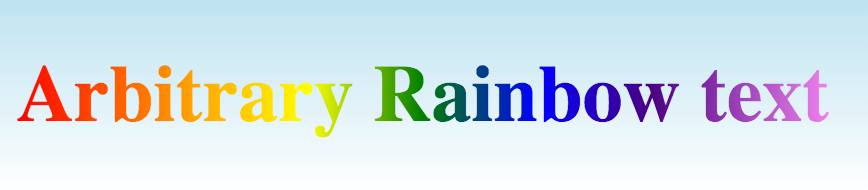
I found quite a lot of the css rainbow examples looked a bit muddy so I took some time trying various different ways of setting up my gradient and found that defining the actual colours you’d see in a rainbow as the centre points (or for the child’s rainbow below as the whole block) works best.
Rainbow text with hard colour changes
The other way to do it, if you want a more defined, child-like rainbow is to double the stops up. This results in a rainbow gradient with hard colour changes:
h1 {
    background: linear-gradient(
        to right,
        red 0%,
        red 14%,
        orange 14%,
        orange 28%,
        yellow 28%,
        yellow 42%,
        green 42%,
        green 56%,
        blue 56%,
        blue 70%,
        indigo 70%,
        indigo 84%,
        violet 84%,
        violet 100%
    );
    background-clip: text;
    color: transparent;
    display: inline-block;
}
This produces an effect more like a child’s drawing of a rainbow with clear lines between the colours:
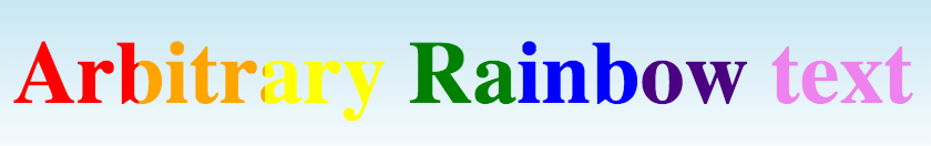
The background incidentally is another linear gradient. This time vertically, from sky blue to white because yellow is quite hard to see against white, and I wanted it to blend back into the page.
#container {
    background: linear-gradient(
        to bottom, rgba(135,206,235,0.5) 0%, rgba(255,255,255,1) 100%
    );
}