Qt Quick Tutorial: 3 Things To Do List Part 1 - Setup
The 3 things todo list is based on the idea that you will be more productive if you pick just 3 things that you need to achieve each day. There are a few blog posts out there explaining the reasoning behind it such as The Power of the Three-Item To-Do List and Accomplish More with a 3-Item To Do List. So, lets go ahead and make one using Qt.
Prerequisites
- Qt and Qt Creator set up on your machine: https://doc.qt.io/qt-6/get-and-install-qt.html
Set up your project
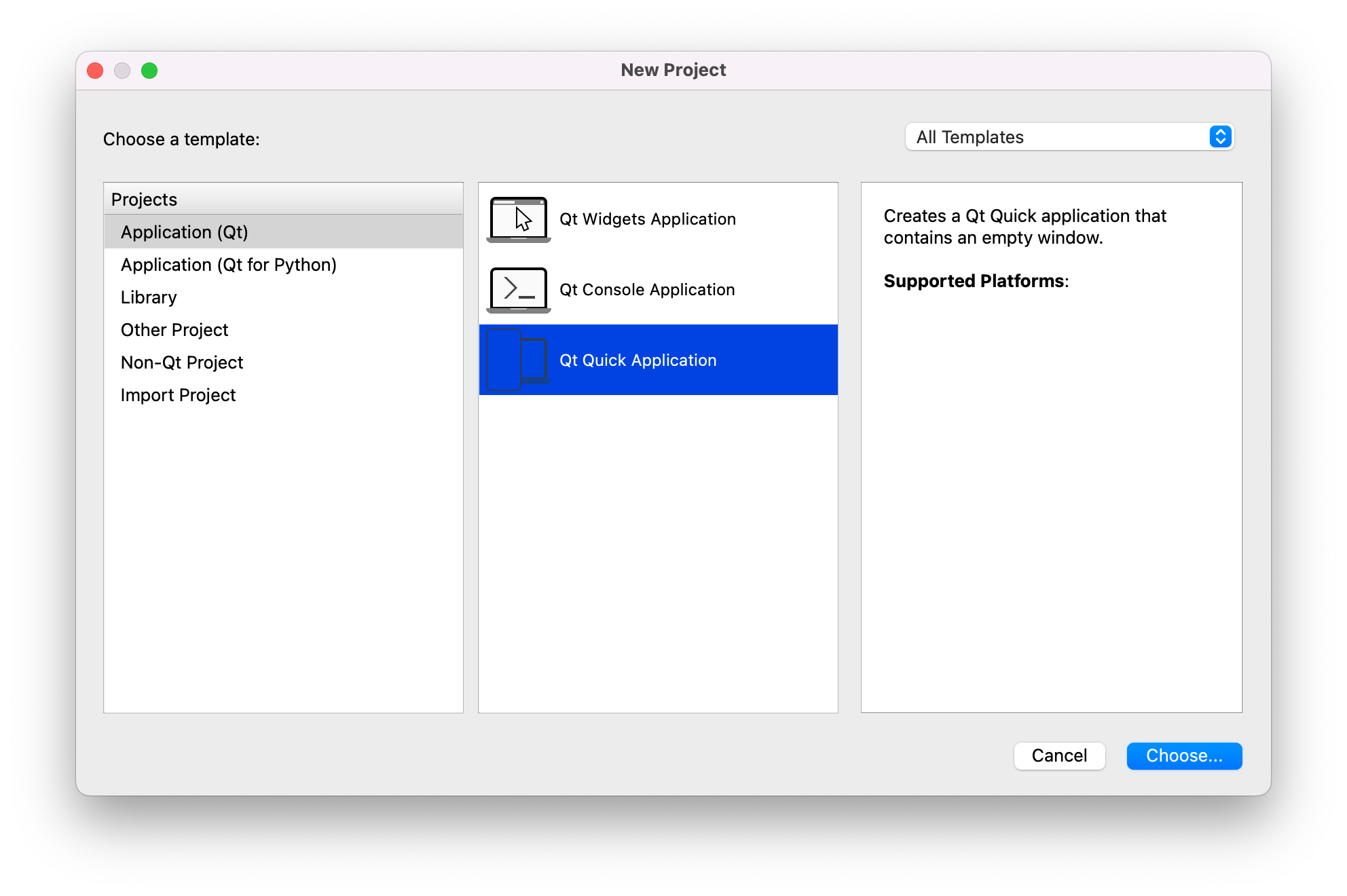
We’re going to be using Qt Quick for this one so go ahead and select that from the New Project Dialog:
Next steps:
- name your project (I called mine ThreeThings) and select a location to save it
- choose CMake as your build system
- Select Qt 6.2 as your Minimal Required Qt version
- Skip translation
- Select the appropriate kit(s) for building the project
- Check you’re happy with the settings on the Summary screen and create your project.
When you first open it you will find 3 files:
CMakeLists.txtmain.qmlmain.cpp
Go into main.qml and change the title: line to
title: qsTr("Three Things")
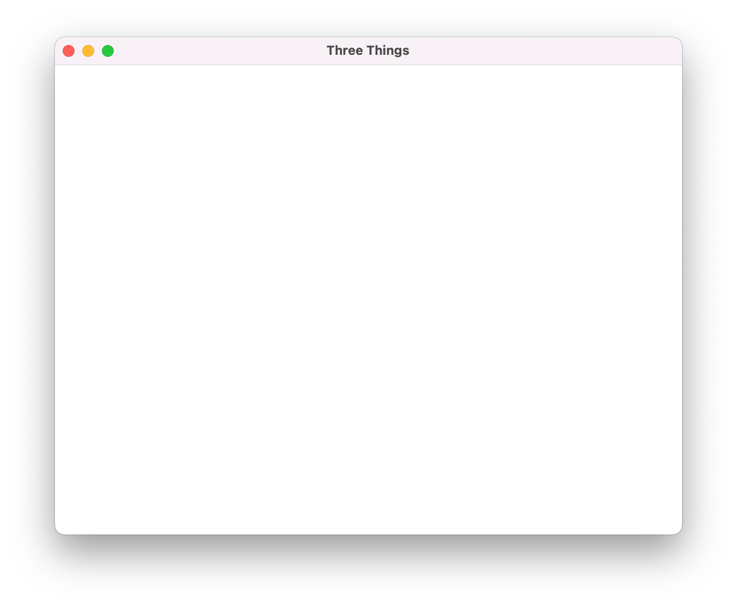
If you run the program now you will get a blank window with the title bar set to Three Things:
That’s exciting (especially the first time you do it) but not very useful. Close it down and lets create some cusom qml to hold our states (the Window QML object requires states to be loaded into child components).
Before we start lets add a couple of custom QML types for the to do items and buttons:
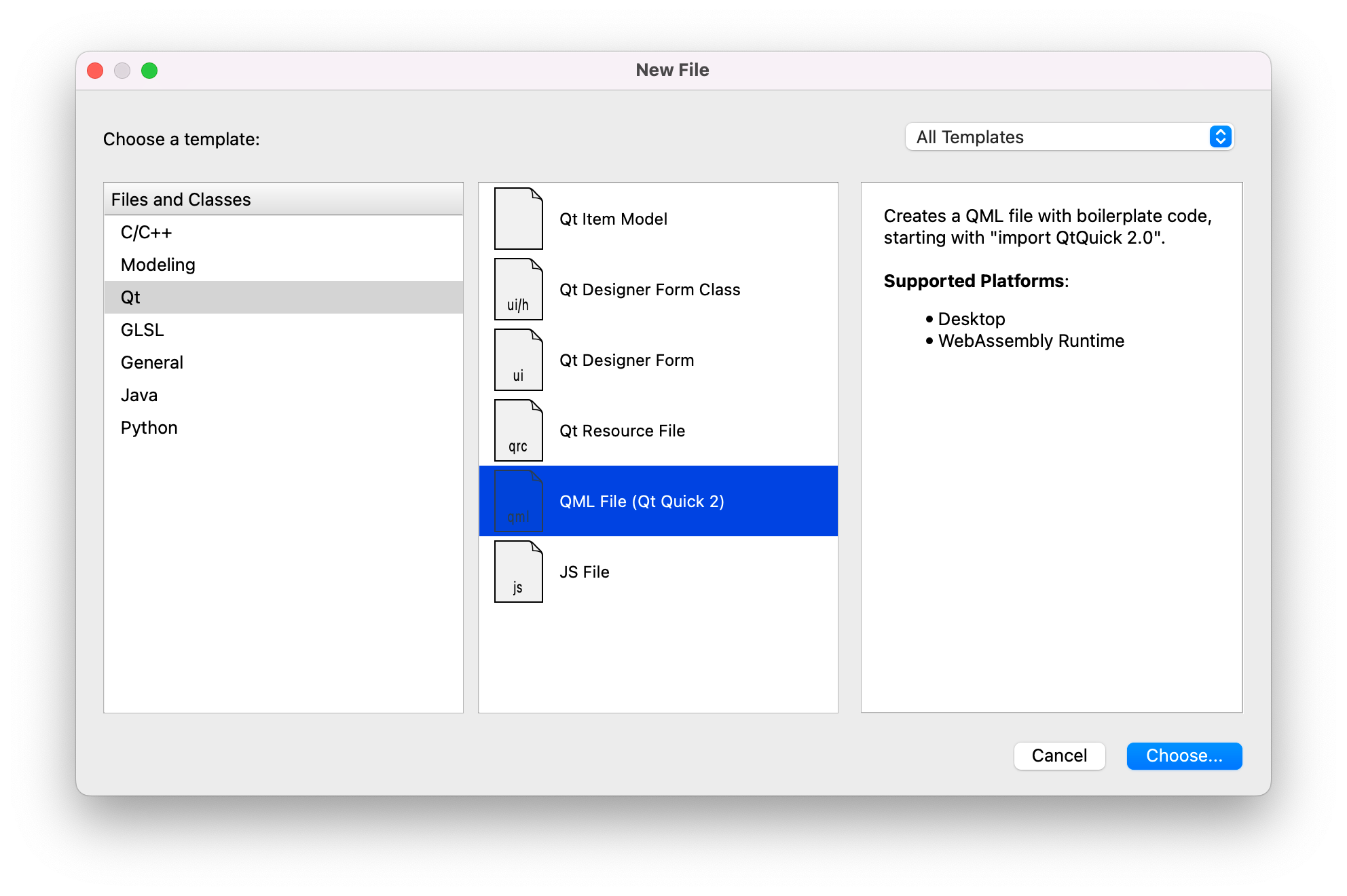
Using the New File dialog go ahead and create TodoItem.qml and CustomButton.qml
Now we need to add those to CMakeLists:
QML_FILES main.qml TodoItem.qml CustomButton.qml
Initial Layout
Open main.qml and set the background color1 to offwhite "#fafafa"
As everything in this view is going to be arranged as a column, and we want our window to be dynamically resizable we can wrap our content in ColumnLayout from Qt Quick Layouts to manage the placement of items. It is considered good practice to give this container item an id of root so that you don’t have to think about what your root element is actually called.
We want the layout to take up all the available space within the Window so we need to set anchors.fill: parent to ensure it does so. We’re also going to set some margins to keep the contents a consistent distance away from the edge of the window and spacing to ensure the gap between items is defined.
import QtQuick
import QtQuick.Layouts

Window {
    width: 640
    height: 600
    visible: true
    title: "Three Things"
    color: "#fafafa"

    ColumnLayout {
        id: root
        anchors.fill: parent
        anchors.topMargin: 16
        anchors.bottomMargin: 24
        anchors.leftMargin: 8
        anchors.rightMargin: 8
        spacing: 8
    }
}
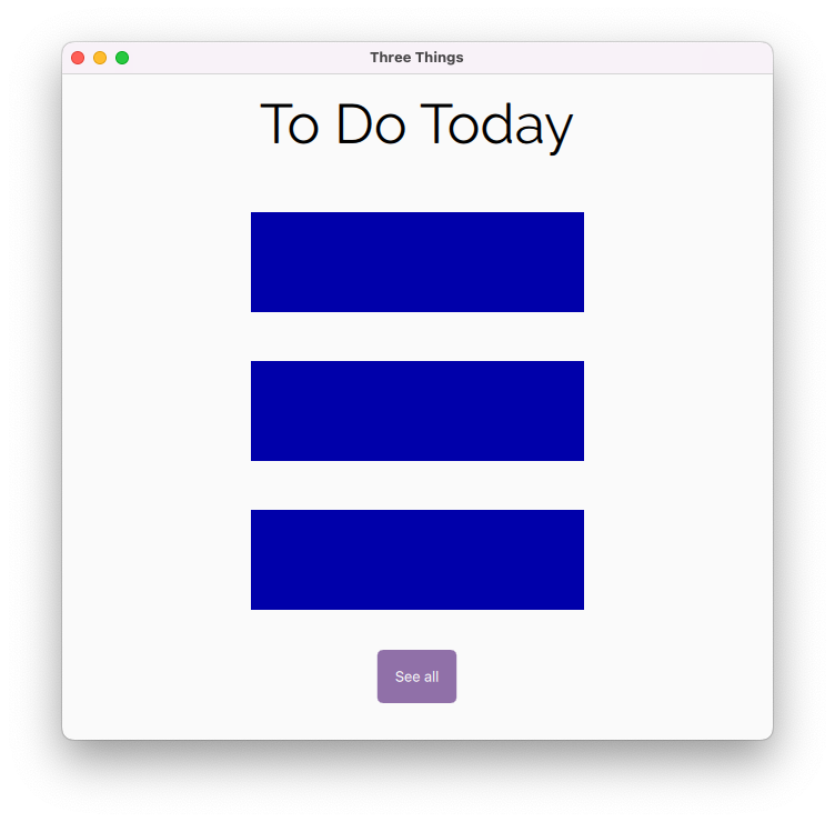
Within the ColumnLayout we’re going to have 3 areas: the header, the to do list itself which we’re going to temporarily going to mock with a Repeater and a button to switch the view from today to all.
ColumnLayout {
    Item {
        id: titleArea
    }
    Repeater {
    \tid: toDoRepeater
    }
    Item {
    \tid: buttonArea
    }
}
Header
In order to center the text within the window we need to wrap it in a container Item. Although it is possible to set width, height and anchor properties on the Item doing so will stop the layout from dynamically re-sizing so instead we’re using Layout properties to set these.
Setting minimumWidth on the container ensures that it will never be narrower than the text it contains.
Setting preferredHeight as the only restriction on the height of the container element will ensure it is interpretted as a fixed height and the placement will not be affected by the other elements being resized. Note: if you don’t set a height for the container it wont have one and the text wont be lined up properly.
The text element itself needs to be statically positioned centrally within its container using anchors.centerIn.
Item {
    id: titleArea
    Layout.fillWidth: true
    Layout.minimumWidth: titleText.width
    Layout.alignment: Qt.AlignTop
    Layout.preferredHeight: titleText.height

    Text {
        id: titleText
        anchors.centerIn: parent
        text: "To Do Today"
        font.family: "Raleway"
        font.pointSize: 50
    }
}
font.family is optional (Qt will use your system font if it’s not specified) and is case insensitive. It can be set to any font you have available, however do make sure to read the licence first.2
To Do Area
This is just a placeholder for our to do items which we’re going to construct in a minute.
Repeater {
    id: toDoRepeater
    model: 3
    Layout.fillWidth: true
    Layout.fillHeight: true
    Rectangle {
        color: "#0000aa"
        width:300
        height: 90
        anchors.horizontalCenter: parent.horizontalCenter
    }
}
Footer
Item {
    id: buttonArea
    Layout.fillWidth: true
    Layout.preferredHeight: switchView.height
    Layout.alignment: Qt.AlignBottom

    Rectangle {
        id: changeView
        anchors.centerIn: parent
        width: txt.width
        height: txt.height
        color: "#aa5c2b80"
        radius: 5

        Text {
            id: txt
            text: "See all"
            padding: 16
            color: "#fafafa"
        }
    }
}
Run it:
Custom Button
As we’re going to have a few different buttons based on Rectangle our code will be cleaner if we create a custom QML type to base them on. Open CustomButton.qml and copy your changeView button code into it in place of the Item removing all the details which are specific to the changeView button and adding a property alias so that you can access the properties of txt from wherever you’re calling CustomButton.
import QtQuick

Rectangle {
    property alias txt: txt
    width: txt.width
    height: txt.height
    radius: 5

    Text {
        id: txt
    }
}
Now go back into main.qml and change your switchView button to this:
CustomButton {
    id: changeView
    anchors.centerIn: parent
    color: "#aa5c2b80"
    txt.text: "See all"
    txt.color: "#fafafa"
    txt.padding: 16
}
While this doesn’t necessarily seem much shorter right now the benefit will come later when we make the buttons functional.
To Do Item
Open ToDoItem.qml and replace Item with Rectangle so that we have the ability to display a border around each item:
import QtQuick
import QtQuick.Layouts

Rectangle {
    width: parent.width
    height: todoItem.implicitHeight + 12
    radius: 10
    border.color: "#777479"
    color: "#00000000"
}
As before we need to set a width and height for the Rectangle to ensure it is visible.
- Setting
radiusgives a curved corner to the rectangle. colorneeds to be set to transparent in order to avoid having a bright white background on our todo items
Add the todo content:

Each item is a row so we’re going to utilise RowLayout for the item itself:
RowLayout {
    id: todoItem
    spacing: 8
    anchors.fill: parent
    anchors.margins: 6
}
anchors.fill to forces the RowLayout to take on the width of its parent element and anchors.margins ensures the content doesn’t hit the edges of our container element.
We’re going to add four elements to our Row: a Text element to contain the actual todo and three CustomButtons for our done, remove and set today buttons.
Text {
    id: itemText
    text: "This is a to do item"
    Layout.margins: 8
    Layout.fillWidth: true
}
Although we already have a CustomButton type we want to set the same font size and padding in each of our CustomButtons so rather than repeat that code in each button we’re going to create a component UpdateButton which inherits CustomButton:
component UpdateButton: CustomButton {
    txt.leftPadding: 7.5
    txt.rightPadding: 7.5
    txt.font.pointSize: 24
}
Now we can then use this component within RowLayout to create the setToday, completed and remove buttons. For the moment we’re going to leave setToday invisible as we only want it to show when we’re looking at all the to do items.
UpdateButton {
    id: setToday
    visible: false
}

UpdateButton {
    id: itemCompleted
    color: "#0ab74f"
    txt.text: "\\u2714"
}

UpdateButton {
    id: removeItem
    color: "#b7190a"
    txt.text: "\\u2718"
}
The txt.text property is being used to set the completed and remove buttons to respectively the unicode characters Heavy Check Mark and Heavy Balot X3
Add the to do items to the main view
Open main.qml and change the toDoRepeater so that instead of creating 3 blue rectangles it gives you 3 TodoItems
Repeater {
    id: toDoRepeater
    model: 3
    TodoItem {}
}
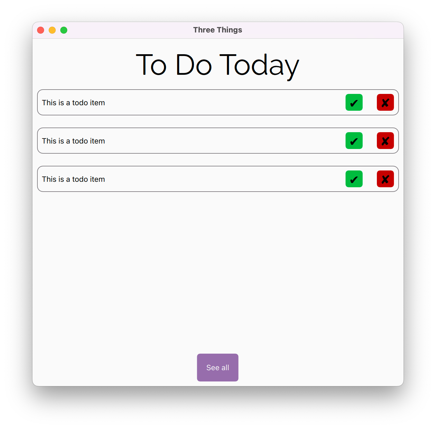
Run it:
Don’t worry about the spacing we’ll fix that when we switch out the repeater for a ListView.
-
The simplest ways to use the color property is either with hex codes, as I have done, or by using colour names such as
"red"or"transparent"(note the inverted commas). If you’re using hex codes transparancy can be added to a colour by prepending the value to the front so"#000000"is black"#00000000"is transparent and"#aa000000"is a 50% transparent black. ↩ -
If you want to set the font for everything in your applicaiton you can define your font in
main.cppusingapp.setFont(QFont("Comic Sans"));. ↩ -
See https://altcodeunicode.com/alt-codes-check-mark-cross-x-mark-ballot-box-symbols/ for alternative symbol options. ↩